Cookie Consent Banner Examples in 2026: 7 Patterns That Still Hold Up
DataShyre StaffAug 3, 2026
9 min read
Cookie Consent Banner Examples in 2026: 7 Patterns That Still Hold Up
If you are searching for cookie consent banner examples on August 3, 2026, the useful question is not which banner looks modern. It is which pattern still gives people a real choice, keeps optional tracking from firing too early, and stays understandable when regulators or internal teams test it later.
That is still the right frame in 2026. The European Commission’s current GDPR guidance says consent must be freely given, specific, informed, and unambiguous, and people must be able to refuse or withdraw it without disadvantage. On April 29, 2026, the UK ICO published final storage-and-access guidance covering cookies, tracking pixels, device fingerprinting, scripts, and similar technologies. On July 14, 2026, the EDPB required the Belgian DPA to assess the merits of a cookie-banner complaint involving broadcaster VRT instead of ending the case on a procedural theory.
If you want the surrounding setup work first, start with our guides to cookie consent, cookie consent banner, and GDPR cookie consent examples. This article is narrower. It is the set of cookie consent banner examples I would compare before shipping a new banner this week.
Why this keyword still matters in 2026
The visible banner is still only the first layer of the problem, but it remains the layer most teams get wrong in public.
CNIL’s current dark-pattern notice says cookie banners must not mislead users and that rejecting cookies should be just as easy as accepting them. Its September 2025 SHEIN decision also shows why design alone is not enough: CNIL said cookies were placed before consent, banner information was incomplete, and refusal or withdrawal did not actually stop later cookie activity.
California adds a different pressure point. The California Department of Justice says a valid Global Privacy Control signal must be honored by covered businesses as a request to stop sale or sharing, and the CPPA’s regulations page shows the current CCPA and CCPA Regulations as effective on January 1, 2026.
That combination is why cookie consent banner examples are not just design inspiration. They are operating models. The pattern you choose affects whether refusal is obvious, whether categories are intelligible, whether later settings are reachable, and whether region-specific logic holds together under testing.
What the strongest cookie consent banner examples have in common
Before comparing layouts, it helps to know what tends to survive review.
The first layer offers a real decision, not a decorated path to acceptance.
Non-essential technologies stay off until the required signal exists.
Purposes are named in plain language instead of vague promises like “improve your experience.”
Users can reopen settings and withdraw later without hunting through the site.
The banner logic fits the region instead of pretending one flow solves every jurisdiction.
The European Commission’s current guidance is still a useful shorthand here: a person should be able to refuse or withdraw consent without being at a disadvantage. The EDPB’s cookie-banner taskforce report also remains practical because it treats the absence of a true reject path on the first layer as a recurring problem, not a minor UX preference.
7 cookie consent banner examples worth studying
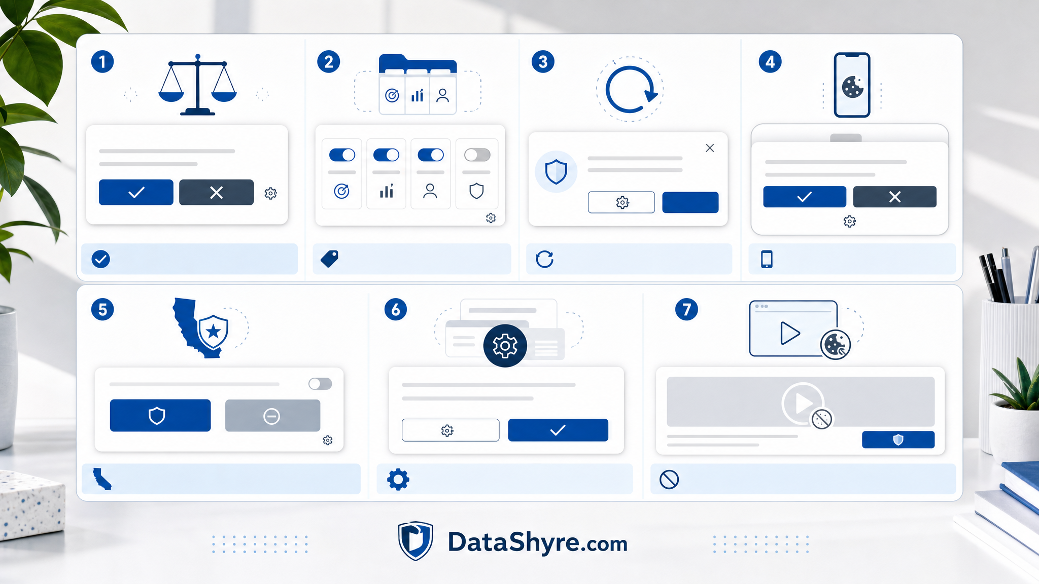
1. The balanced bottom bar
This is still the safest starting point for many sites.
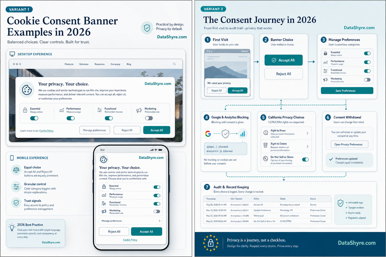
It uses a short explanation, two equally visible primary actions such as Accept all and Reject all, and one secondary path such as Manage settings. The best version is compact without hiding the decision.
Why it holds up:
the first action layer is symmetrical;
the language is short enough to read;
design bias is easier to spot in review;
product and legal teams can usually test it quickly.
This is one of the best cookie consent banner examples when your stack is moderate and you need something easy to audit.
2. The centered first-layer modal with three clear actions
This pattern works well when the site uses multiple optional categories and the team wants a more conservative first interaction.
The opening layer shows three clear choices: Accept all, Reject all, and Customize. The point is not complexity. The point is to let users refuse, accept, or go granular from the same screen.
Why it holds up:
refusal is not delayed behind another click;
category review remains available for users who want detail;
it maps cleanly to EU and UK expectations around valid consent.
When teams ask me for cookie consent banner examples that fit a heavier martech stack, this pattern is usually near the top.
3. The category-first banner for higher-risk stacks
Some teams should not lead with a broad accept-or-reject framing at all. They should lead with categories.
In this pattern, the first layer still includes a refusal path, but the main emphasis is on clearly named categories such as analytics, advertising, embedded media, and functional tools. Non-essential toggles start off.
Why it holds up:
it makes purpose language more concrete;
it reduces the chance that consent becomes too broad for the real stack;
it is easier to compare banner text to the tools actually present on the page.
This is one of the stronger cookie consent banner examples when a site uses many vendors and the team needs tighter category discipline.
4. The mobile bottom sheet with persistent return access
Mobile is where many fair desktop designs quietly turn into dark patterns.
The better mobile version uses a bottom sheet or slide-up panel with a readable sentence, equal-weight accept and reject choices, and a visible settings path. After the first choice, a footer link or persistent privacy icon remains available.
Why it holds up:
it fits smaller screens without hiding refusal;
it avoids the “single bright button plus tiny settings text” trap;
it treats later withdrawal as part of the design, not as a footer afterthought.
If mobile traffic dominates, you should review cookie consent banner examples on real devices, not just in a design file.
5. The California hybrid with a privacy-choices path
This is where jurisdictional discipline matters.
A California-focused pattern may pair a concise tracking notice with a persistent Your Privacy Choices or Do Not Sell or Share My Personal Information path. If the business sells or shares personal information and supports browser-level signals, the flow also needs to honor GPC.
Why it holds up:
it fits California’s opt-out mechanics better than a copied EU-only flow;
it supports browser-level preference handling where required;
it helps separate sale-or-sharing logic from EU-style prior-consent logic.
This is one of the most useful cookie consent banner examples for US teams that have been relying on an EEA banner alone.
6. The logged-in preference center tied to account settings
For subscription products, member areas, and SaaS environments, the visible banner is not enough by itself.
This pattern keeps the first-layer banner simple but connects it to an account-level privacy or cookie settings area. The user can revisit choices later, and the team can align banner settings, account settings, and downstream controls more cleanly.
Why it holds up:
withdrawal stays easy after the first session;
support and legal teams have a clearer place to verify what users can change;
it reduces drift between public-page consent and logged-in preferences.
Not every business needs this, but it is one of the more durable cookie consent banner examples for products with repeat users.
7. The embedded-media placeholder consent card
This is less flashy than a homepage banner and often more revealing.
Instead of loading optional video, map, chat, or social embeds immediately, the page shows a placeholder card explaining that the feature uses optional technologies and offering a clear way to enable that category or open settings.
Why it holds up:
it matches the real point of collection more closely;
it reduces accidental pre-consent firing through third-party embeds;
it gives users context at the moment the optional feature matters.
Many cookie consent banner examples look compliant until embedded media starts setting cookies before the main banner choice. This pattern helps close that gap.
What to test before you copy one
If I were reviewing cookie consent banner examples for a live site this week, I would test them in this order:
Confirm whether Reject all is truly as visible and accessible as Accept all.
Inspect the page before interaction to see whether non-essential cookies, pixels, or tags fire early.
Check whether each stated category maps to real tools and real purposes.
Reopen settings after the first choice and verify withdrawal actually changes behavior.
Test region logic separately for EU or UK flows and California opt-out or GPC handling.
Re-test on mobile where spacing, contrast, and button hierarchy often drift.
Check embedded media, chat, maps, and other third-party widgets on content pages, not just the homepage.
That short review catches more practical failures than most banner galleries do.
Bottom line
The best cookie consent banner examples in 2026 are not the prettiest ones. They are the ones that make refusal obvious, explain purposes clearly, keep optional technologies from acting too early, and let people come back later without friction.
That is also why the visible layer cannot be judged on copy alone. CNIL’s recent cookie enforcement, the ICO’s 2026 storage-and-access guidance, the EDPB’s July 2026 action, and California’s live GPC position all point the same way: the banner has to reflect real control, not decorative compliance.
If your current banner still hides refusal, compresses categories into one vague sentence, or treats settings as a dead-end page, it is probably time to replace the pattern rather than just rewrite the text.