

Cookie Consent Banner Examples in 2026: 7 Patterns You Can Adapt Without Faking Compliance
If you are searching for cookie consent banner examples on August 20, 2026, the useful question is not which banner looks the most polished in a mockup. It is which example still makes sense after you test the reject path, the settings layer, the regional logic, and the tags or embeds that actually run on the site.
That question still matters because the regulatory baseline is live, not historical. The European Commission still says consent must be freely given, informed, specific, and tied to a clear affirmative act, and that people must be able to refuse or withdraw without disadvantage. The UK ICO finalized its storage-and-access technologies guidance on April 29, 2026 and made clear the review is broader than classic browser cookies alone, extending to tracking pixels, scripts, tags, fingerprinting, and similar technologies. In France, CNIL is still repeating the sharpest first-layer design warning in one sentence: users should be able to reject as easily as they accept. And on July 14, 2026, the EDPB required the Belgian DPA to handle the merits of a cookie-banner complaint involving broadcaster VRT, which is a reminder that banner scrutiny has not faded into background noise.
If you want adjacent context first, start with our guides to cookie consent banner, cookie consent message examples, and GDPR cookie consent examples. This article is narrower. It is a set of cookie consent banner examples you can adapt while keeping the real compliance constraints in view.
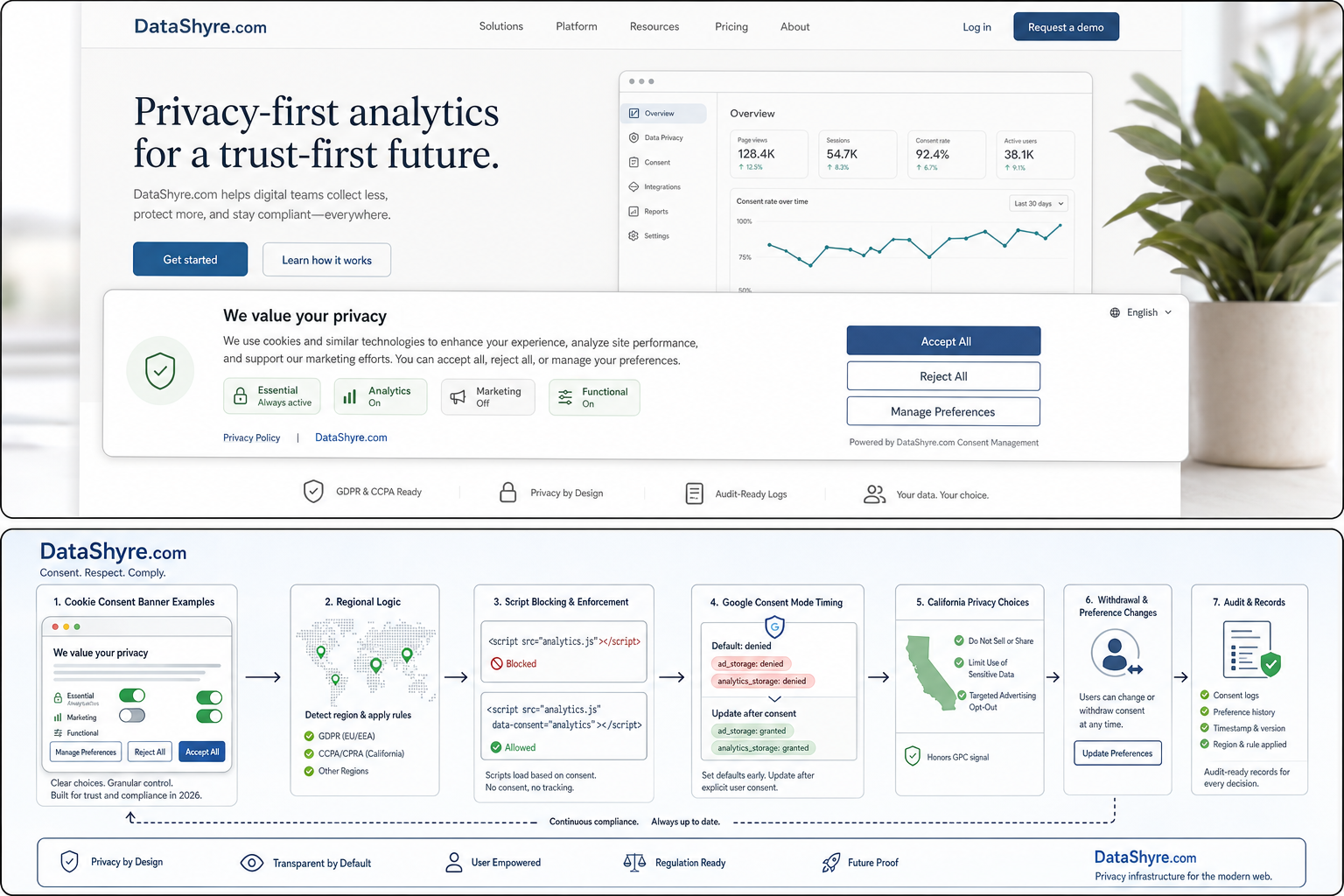
What strong cookie consent banner examples have in common
Before the examples, the shared pattern matters more than the exact wording.
The best cookie consent banner examples usually do five things well:
- they state the main optional purposes in plain language;
- they offer a real refusal path on the first layer where that structure is required;
- they avoid describing optional tracking as if it were all strictly necessary;
- they point users to a settings layer they can actually reopen later;
- they match the technical behavior of the live site.
The ICO’s April 2026 launch note captured the broader user goal well when William Malcolm said people should have “meaningful control over how their data is used.” That is a better drafting test than whether the banner feels modern.
The European Commission’s line is even more practical:
“It should be as easy to withdraw as to give consent.”
If a banner example sounds good in a content doc but falls apart when a user tries to reverse the choice later, it is not a strong example.
7 cookie consent banner examples you can adapt
1. The balanced three-choice banner
This is the safest default for many business sites:
We use cookies and similar technologies to run the site, measure traffic, and support marketing. You can accept all, reject non-essential tracking, or manage preferences. You can change your choice any time in Cookie Settings.
Why this example works:
- it names the broad purposes without hiding behind vague language;
- it gives a visible refusal path;
- it points to later withdrawal;
- it does not imply consent is required to browse the site.
For many teams, this is the best starting point when they search for cookie consent banner examples because it is flexible without being evasive.
2. The analytics-only or analytics-first banner
Some sites mostly need consent language for optional analytics:
We use essential technologies to keep the site working and optional analytics tools to understand performance. You can accept analytics, reject optional tracking, or review settings first. Your choice can be updated later.
This version is only honest if the site really is that narrow. If advertising, session replay, embedded media, or personalization tools are also active, do not use a shorter example just because it reads better on the screen.
3. The ecommerce banner
Commerce sites often need to distinguish site operation from optional marketing:
We use cookies and similar technologies to power checkout, remember your preferences, measure store performance, and support marketing. You can accept all, reject non-essential tracking, or manage preferences. Update your choice any time in Privacy Settings.
This is one of the more useful cookie consent banner examples because it helps explain why some technologies may stay on while still making the optional layer clear.
4. The publisher or ad-supported banner
If ads help fund the site, say that plainly:
We use cookies and similar technologies to operate the site, understand audiences, personalize content, and support advertising. You can accept all, reject non-essential uses, or manage choices by purpose. You can revisit these settings later.
This is where generic phrases like “improving your experience” become least helpful. If audience measurement or advertising is part of the model, the banner should say so in human language.
There is also a separate product-operational branch here. Google’s current publisher help still says a certified CMP integrated with the IAB Transparency and Consent Framework is required for serving personalized ads to users in the EEA, the UK, and Switzerland. That does not replace your legal review, but it does affect which banner setups are operationally viable for ad-supported publishing.
5. The embedded-content banner
Not every useful banner example needs to be site-wide:
This video uses optional cookies and similar technologies from a third party. Choose
Allowto load the content now, or continue without it. You can revisit this choice in Cookie Settings.
This is one of the strongest cookie consent banner examples for blogs, knowledge bases, and support centers that use video, maps, chat widgets, or other embedded tools with their own tracking behavior.
6. The compact mobile-first banner
Smaller screens often need tighter copy:
We use cookies and similar technologies for site performance, analytics, and marketing. Accept all, reject non-essential tracking, or open settings. Change your choice any time.
The risk on mobile is usually not only the sentence length. It is whether Reject becomes visually weaker, harder to tap, or pushed below the fold while Accept stays immediate.
That is exactly why CNIL’s current message still matters:
“rejecting cookies should be just as easy as accepting them.”
7. The California privacy-choice banner
Some sites need a banner or top-layer prompt that reflects California-specific choice logic:
We use cookies and similar technologies for analytics and advertising. California visitors can use Privacy Choices to opt out of sale or sharing, and qualifying browser privacy signals are honored where required.
The California Department of Justice still describes Global Privacy Control as a “stop selling or sharing my data switch” and says covered businesses must honor it as a valid request where applicable. So if your site serves California users, some cookie consent banner examples should describe that path honestly instead of pretending every jurisdiction works like EU-style prior consent.
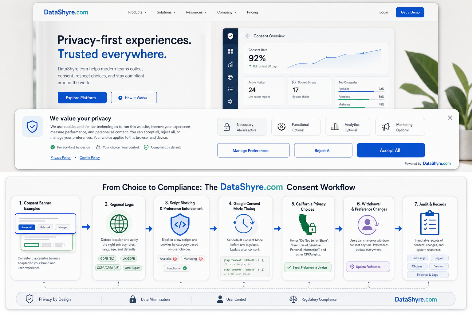
What weak cookie consent banner examples usually get wrong
The same problems keep repeating:
- they say “we value your privacy” but never explain the optional purposes;
- they make
Accept allimmediate while slowing or softening rejection; - they mention only cookies when the site also uses pixels, scripts, or fingerprinting-like methods;
- they promise later control without an easy way to reopen settings;
- they sound narrower than the actual tracking stack.
That is why banner examples should be chosen after a quick runtime review, not before it. The wording needs to describe the system you really operate.
A quick review before you reuse any of these examples
Before you publish one of these cookie consent banner examples, run a short validation sequence:
- Check which optional technologies the site actually uses on high-risk templates.
- Confirm the first layer names the main purposes in plain language.
- Make sure rejection is as visible and usable as acceptance where your structure requires that.
- Test whether optional tags, pixels, scripts, or embeds stay off after refusal.
- Reopen settings later and confirm withdrawal still changes behavior.
- For California traffic, verify that any qualifying browser privacy signal and opt-out path match the words on the banner.
- If publisher monetization is in scope, test the separate Google and TCF branch too.
That short sequence usually tells you more than another round of copy edits.
Bottom line
The most useful cookie consent banner examples in 2026 are not the ones with the prettiest button styling. They are the ones that explain purpose clearly, support a fair refusal path, reflect regional reality, and still line up with live technical behavior after deployment.
If you borrow one of these examples, borrow the testing mindset with it. That is what keeps a banner from becoming decorative compliance copy instead of a real choice interface.
Sources
- European Commission: Legal grounds for processing data
- UK ICO: Final storage and access technologies guidance published
- UK ICO: Guidance on the use of storage and access technologies
- CNIL: Dark Patterns in Cookie Banners: CNIL issues formal notice to website publishers
- European Data Protection Board: EDPB requires Belgian DPA to handle the merits of NOYB cookie banner complaint
- California Department of Justice: Global Privacy Control
- California Department of Justice: CCPA
- California Privacy Protection Agency: Law & Regulations
- Google for Developers: Set up consent mode on websites
- Google Ad Manager Help: Google consent management requirements for serving ads in the EEA, the UK, and Switzerland
This post was updated on August 20, 2026 using current official regulator, government, and platform materials available at publication time.