

GDPR Popup Examples: 5 Consent Popups That Make Refusal Easy in 2026
Most teams do not need a prettier banner. They need a first layer that gives people a real yes-or-no choice, explains what optional tracking does, and still works once the marketing stack gets messy.
That is the value of strong gdpr popup examples. The legal baseline is still straightforward: consent must be freely given, specific, informed, and unambiguous, and silence or pre-ticked boxes do not count. Regulators have also made the design point harder to dodge. The EDPB’s cookie banner taskforce treated missing reject options as a recurring problem, and the ICO has kept repeating the same usability rule. As UK Information Commissioner John Edwards put it, it must be “just as easy to reject” non-essential cookies as it is to accept them.

If you want broader pattern libraries, our guides to GDPR cookie consent examples, cookie consent banner examples, and GDPR cookie consent requirements are useful companion reads. This article stays focused on popup patterns a business can actually ship.
What a compliant popup still has to do
Before color, spacing, or animation, a valid consent popup needs three things:
- a visible reject option at the same decision point as accept
- plain-language purposes before the click
- an easy way to revisit and withdraw later
EDPB Chair Anu Talus has framed the broader consent question as one of “real choice.” That is the cleanest test for any popup review. If the interface nudges people toward yes, hides the no, or makes later withdrawal awkward, the design problem is also a compliance problem.
Five popup patterns worth borrowing
1. The balanced marketing-site popup
This is the default pattern for most B2B sites.
Example first layer:
We use cookies for analytics, personalization, and advertising. Choose what you allow.
[Accept all] [Reject all] [Customize]
Why it works:
- Accept and reject sit on the same layer.
- The user sees the purposes before making a choice.
- Customize is a real third path, not a delay tactic for refusal.
This structure also lines up with the CNIL’s continued focus on whether refusing cookies is as easy as accepting them. For most teams, gdpr popup examples are really decision-architecture examples. Clean design helps, but button hierarchy matters more.
2. The ecommerce popup with plain-language purposes
Retail sites tend to collect more tools, more tags, and more vague wording than they should.
Example first layer:
We use cookies to keep the store working, measure visits, and show more relevant offers. You can accept all, reject non-essential cookies, or choose by purpose.
[Accept all] [Reject all] [Choose by purpose]
Why it works:
- It separates essential functions from optional tracking.
- “Measure visits” is clearer than fuzzy phrasing like “improve experience.”
- It gives the user a fast no, not just a settings maze.
This kind of wording usually ages better because product, legal, and marketing teams can all understand what the popup is claiming.
3. The publisher popup that avoids dark patterns
Publishers keep drawing scrutiny when the accept path is loud and the reject path is dim, tiny, or hidden in body copy.
Example first layer:
We use cookies for site analytics and advertising. You can accept, refuse, or review each purpose.
[Accept all] [Refuse all] [Review choices]
Why it works:
- Refusal is explicit.
- Reject is a button, not a hard-to-spot text link.
- The wording tells the user what the next step will be.
The enforcement angle is not abstract. In December 2024, the CNIL publicly said it had issued compliance orders over misleading cookie banner designs. In November 2025, it fined the company publishing vanityfair.fr after finding that cookies subject to consent were still placed even when users tried to refuse or withdraw. Those cases are a useful reminder that popup design and backend behavior get judged together.
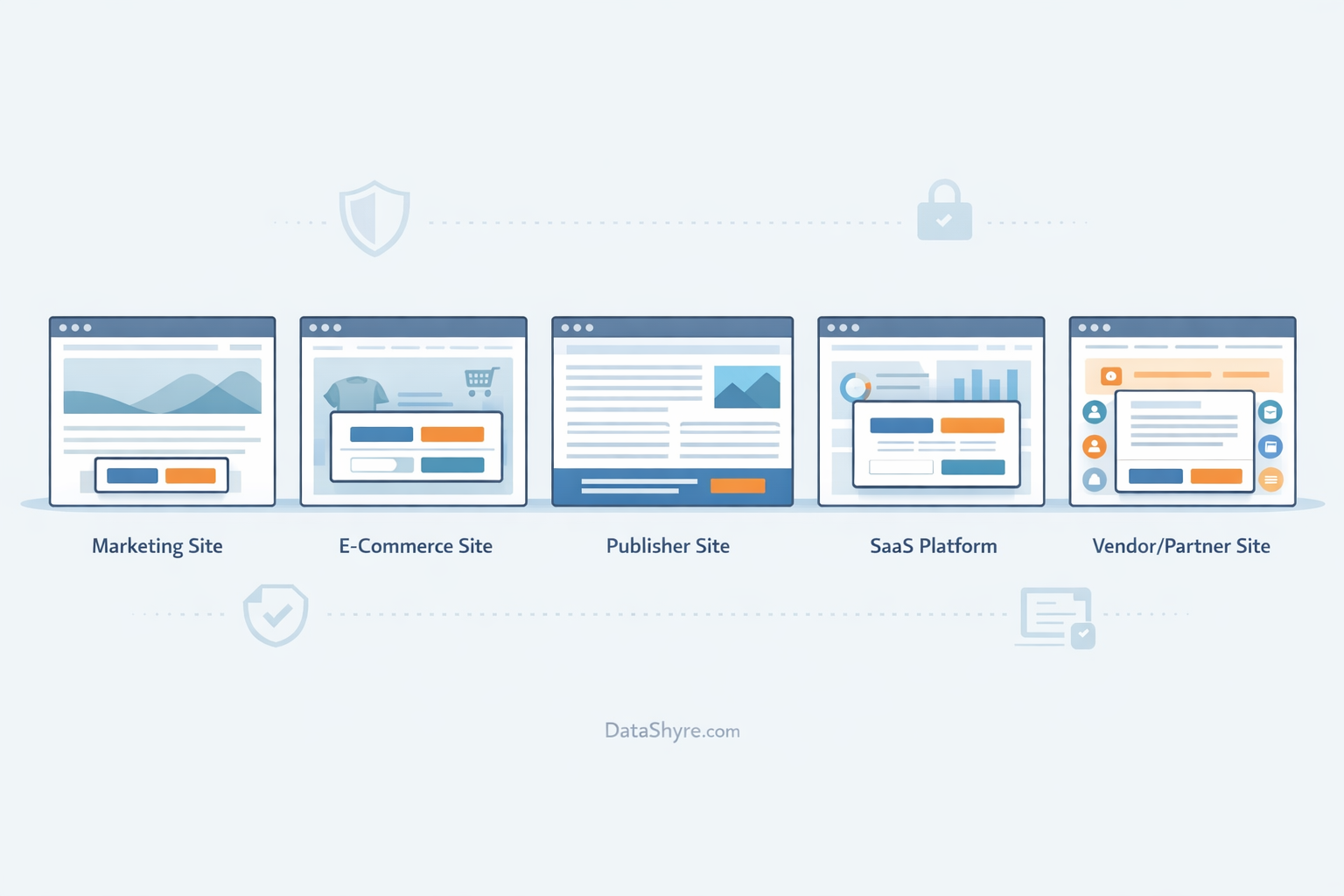
4. The SaaS popup with a persistent settings route
SaaS teams often spend all their energy on the first click and forget the second question: can the user change their mind later without hunting through the footer?
Example first layer:
We use optional cookies for product analytics and marketing. Make your choice now, and update it any time in Cookie Settings.
[Accept all] [Reject all] [Manage settings]
Why it works:
- It makes reversibility clear up front.
- It connects the popup to a permanent control.
- It is easier for support and product teams to explain later.
The ICO’s current guidance is blunt on this point: withdrawal should be available with the same ease as consent. The EDPB taskforce likewise pointed to visible icons or links as practical ways to let users revisit their choices.
5. The partner-heavy popup for messy ad stacks
Some sites need to be more candid because the tracking stack really is more complex.
Example first layer:
We and selected partners use cookies for audience measurement, content personalization, and advertising. You can accept all, reject all, or review partners and purposes.
[Accept all] [Reject all] [Review partners]
Why it works:
- It signals that third parties are involved.
- It gives users a direct path to partner-level review.
- It treats transparency as part of the popup instead of burying it somewhere else.
If the site relies on a long vendor chain, this is usually the more durable pattern. People do not need cheerful copy. They need enough information to make a decision that means something.
What the weak versions still get wrong
The same bad patterns keep showing up:
- reject hidden as a low-contrast link while accept is a large button
- pre-enabled toggles for optional purposes
- one-click acceptance but multi-step refusal
- purpose labels so vague that the user cannot tell what will happen
- withdrawal controls that exist in theory but do not actually stop downstream tags
William Malcolm of the ICO recently said businesses should give consumers “meaningful control over how their data is used.” That line lands because it is operational. The choice on the popup has to change what the site actually does.
Bottom line
The best gdpr popup examples are usually the least dramatic ones. They state the purpose clearly, present yes and no with equal weight, and keep the later withdrawal path easy to find.
If your team is redesigning consent this quarter, start there. A cleaner first layer, more honest purpose labels, and a persistent settings route will do more for risk reduction than another round of visual polish.
Sources
- EUR-Lex
- European Data Protection Board
- Information Commissioner’s Office
- CNIL