GDPR Cookie Consent Examples: 7 Patterns That Hold Up in 2026
If you are searching for gdpr cookie consent examples, the useful question is not which banner looks modern. It is which patterns still hold up when somebody clears cookies, clicks reject, opens developer tools, and checks what actually fired.
That is why the examples worth copying in 2026 are operational, not decorative. The European Data Protection Board’s consent guidance is still the baseline. The EDPB’s 2023 cookie-banner task force report is still relevant. On July 14, 2026, the EDPB also required the Belgian DPA to handle the merits of a NOYB cookie-banner complaint instead of letting the matter end on procedural grounds. Cookie interfaces are still very much a live enforcement topic.
If you want the surrounding baseline first, our guides to GDPR cookie consent requirements, cookie consent banner examples, and cookie consent examples cover the broader rules and implementation context. This article is narrower: seven banner and preference patterns that are actually worth borrowing.
What good GDPR cookie consent examples have in common
Before the patterns, the common standard:
Non-essential cookies or similar trackers stay off before choice.
Reject is visible on the first layer when accept is visible on the first layer.
Categories such as analytics and marketing are optional and off by default unless the user opts in.
Users can come back and change their decision later.
The organization can show what the banner said, what the user chose, and when it happened.
The French CNIL put the core design principle in plain language in December 2024:
“Rejecting cookies should be just as easy as accepting them.”
>
CNIL, formal notice to website publishers on dark patterns in cookie banners
That is still the fastest filter for judging GDPR cookie consent examples. If refusal takes more effort, the design is already drifting in the wrong direction.
7 GDPR cookie consent examples worth copying
1. The equal-button first layer
This is the safest default for most sites:
Accept all
Reject all
Manage settings
All three choices are visible immediately. The button styling does not make one path feel like the “correct” answer. This pattern lines up well with the CNIL’s dark-pattern warnings and with the EDPB cookie-banner task force focus on deceptive contrast, wording, and interaction design.
2. The short first layer plus granular second layer
A good first layer does not need to explain everything. It needs to explain enough and route users to real control. The second layer can then split optional purposes into clear categories such as analytics, marketing, personalization, or social media.
This is one of the better gdpr cookie consent examples for SaaS sites and content-heavy brands because it keeps the first interaction simple without hiding the refusal path.
3. The mobile-first stacked banner
Many banners that look balanced on desktop become manipulative on mobile because the reject option drops below the fold or turns into a faint text link. A better mobile pattern stacks the actions clearly:
Accept all
Reject all
Manage settings
Each tap target should stay obvious without scrolling. In practice, mobile is where a lot of otherwise decent banners fail.
4. The embedded-feature consent prompt
Not every consent request needs to be global. If an embedded video, map, chat widget, or social feed needs optional cookies, a contextual prompt can work well:
Explain what the feature needs.
Offer Allow and Cancel.
Keep the rest of the site usable without forcing consent for unrelated purposes.
This is one of the most useful GDPR cookie consent examples for publisher pages and knowledge bases with third-party embeds.
5. The persistent settings return path
A banner is only the opening move. Users also need a stable way back to their settings. Good implementations usually add one of these:
a footer link such as Cookie settings
a floating privacy icon
an account-level preferences link when consent is tied to a signed-in experience
Without that return path, withdrawal becomes harder than giving consent, which is exactly the kind of friction regulators keep examining.
6. The publisher-ready CMP pattern
Publishers and ad-supported sites need one more layer of discipline. Google’s current publisher guidance says personalized ads in the EEA, the UK, and Switzerland require a certified CMP integrated with the IAB Transparency and Consent Framework. That does not define GDPR by itself, but it does change what a practical banner has to support in production.
For those teams, the best GDPR cookie consent examples do not stop at visual balance. They also prove that consent states pass correctly into ad tech, measurement, and downstream vendors.
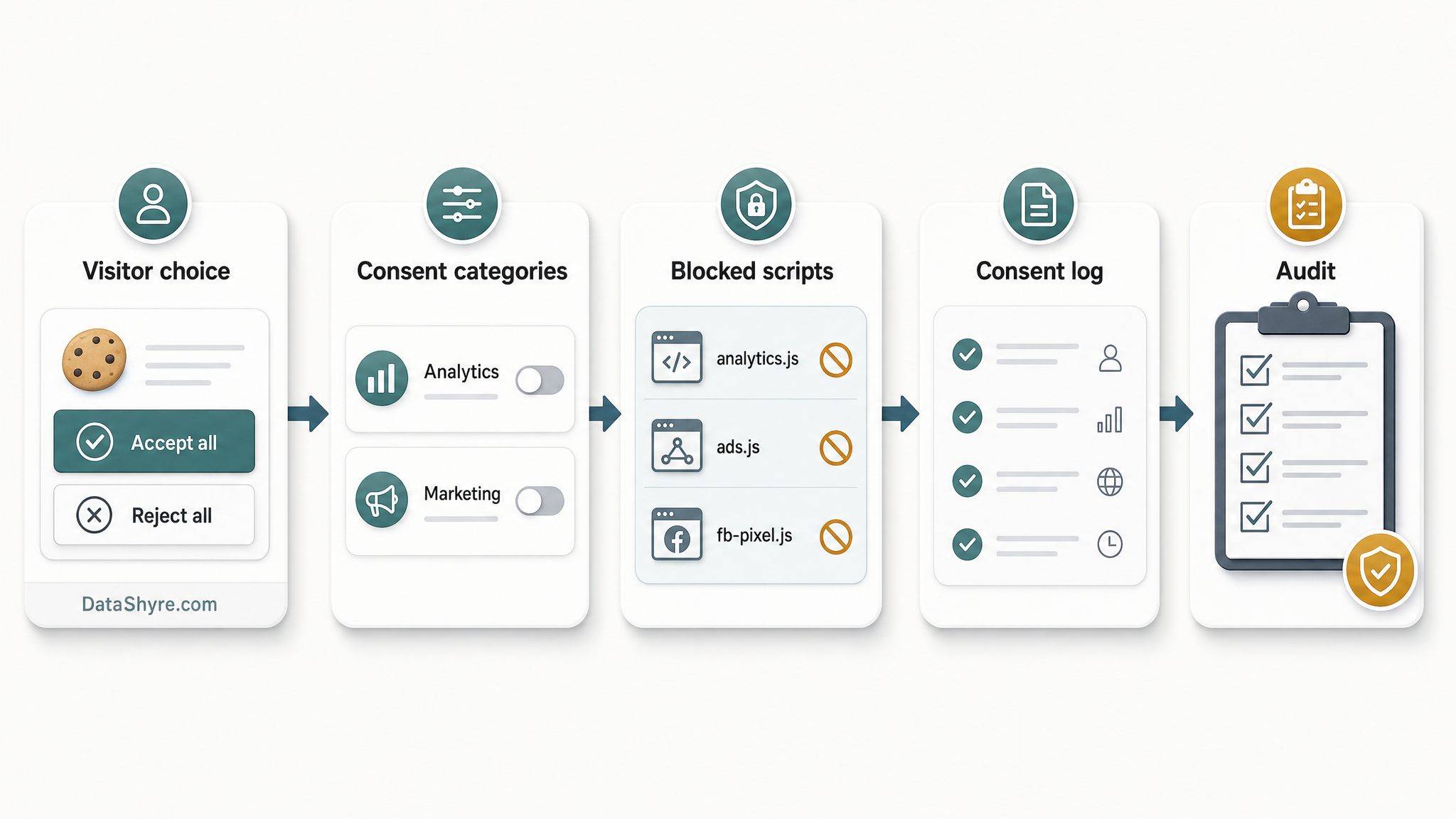
7. The audit-ready logged-consent pattern
The strongest pattern is not visual at all. It is operational:
the banner version is recorded
the user’s choice is recorded
preference changes are recorded
downstream tags update when the choice changes
That is what separates a nice banner from a usable compliance control. In September 2025, the CNIL fined SHEIN 150 million euros over cookie failures. The same day, the CNIL fined Google 325 million euros over ads inserted between Gmail messages without consent and cookie placement issues during account creation. The lesson is blunt: if the technical behavior does not match the promised choice, the interface will not save you.
A quick test for any banner you are reviewing
When I review gdpr cookie consent examples, I use a simple sequence:
Open a fresh browser session.
Click Reject all.
Confirm that analytics, advertising, and similar non-essential technologies did not fire.
Open the settings panel and make sure categories are off by default unless exempt.
Change the choice and confirm the system updates.
Find the return path later without hunting for it.
If the banner fails any one of those checks, it is not a model example yet.
Why this still matters in 2026
The legal standard is not getting looser. On April 29, 2026, the UK ICO published final guidance on storage and access technologies and said 99% of the UK’s top 1,000 websites now meet its cookie-banner compliance standards after focused work with industry. That is a useful signal. Regulators are not treating this as abstract theory anymore. They are measuring visible outcomes and pushing the market toward a more stable baseline.
For most teams, that means the target is now clear enough:
equal refusal
prior blocking where required
granular optional choices
easy withdrawal
records the team can actually use
That is the standard the best GDPR cookie consent examples now reflect.
Bottom line
The most useful gdpr cookie consent examples are not the cleverest designs. They are the ones that make refusal easy, keep optional tracking off before consent, and hold together after real testing on desktop, mobile, and tag-heavy pages.
If you copy those patterns instead of copying surface-level aesthetics, you end up much closer to a banner that works in practice and reads credibly in an audit.