Cookie Consent Text: 7 Rules and 3 Examples for 2026
Most bad banners do not fail because a designer picked the wrong color. They fail because the words are vague, pushy, or trying to do too much at once. Good cookie consent text tells people what is happening, what the choice means, and how to say no without hunting for a second screen.
If you need the broader compliance baseline first, start with our cookie consent guide. If you are rewriting a Europe-facing banner, our GDPR cookie consent examples and cookie consent message examples are useful companions.

This article is for teams rewriting banner copy, preference-center labels, or privacy-choice links in 2026. The short version: your copy should be specific, plain, balanced, and matched to the legal job in the region where the user is located.
What good banner copy has to do in 2026
The wording has four jobs.
First, it has to explain the purpose clearly. In the UK ICO’s April 29, 2026 update to its storage and access technologies guidance, Executive Director William Malcolm said organizations wanted “clear, practical guidance.” That is still the right standard for banner copy: plain enough to understand on first read.
Second, it has to support a real choice. In the European Data Protection Board’s 2024 opinion on consent-or-pay models, Chair Anu Talus said users should get a “real choice.” That opinion focused on large online platforms, but the principle carries over to cookie banners. If the copy says “Accept” in big type and pushes refusal into a second step, the words and the interface are steering the outcome together.
Third, it has to avoid fake consent. The ICO’s current cookies guidance still uses passive-consent wording as a bad example. Silence, scrolling, or inaction is not the same as a valid yes for non-essential tracking.
Fourth, it has to match the region. Europe and the UK usually turn the first layer into a prior-consent moment for non-essential cookies. California often turns the homepage or footer into a privacy-choice moment instead, with links such as “Your Privacy Choices” and support for opt-out preference signals.
7 wording rules business teams should use
1. Name the technologies or purposes plainly
Say “analytics cookies,” “advertising cookies,” or “session replay” if that is what you mean. Do not hide behind phrases like “enhance your experience” unless you also explain how.
2. Separate information from persuasion
Good banner copy is short because it does less selling. If the first sentence sounds like marketing copy, trim it. Users do not need a brand speech before they make a privacy choice.
3. Put reject language at the same level as accept language
The CNIL’s cookies FAQ has repeated this point for years: refusing cookies should be as easy as accepting them. If your first layer offers “Accept all” and “Customize” but no equally visible refusal path, the wording is part of the problem.
4. Avoid bundled purposes
Do not collapse analytics, ad targeting, social media, and partner sharing into one fuzzy permission line. Specific purposes create cleaner records and cleaner downstream controls.
5. Tell users what happens if they say no
This is the sentence many teams skip. Usually it can be simple: the site still works, but analytics or personalized ads stay off. That lowers anxiety and reduces the pressure to click yes just to get rid of the banner.
Good cookie consent text also lowers support friction because users understand the consequence of the choice before they click.
This is also where the language should stop sounding defensive. Malcolm’s other useful phrase from the ICO update is “meaningful control over how their data is used.” People get that control only if the banner explains the consequence of yes and no in plain English.
6. Keep California choice copy distinct
If your California flow is about opting out of sale or sharing, say that directly. Do not relabel it as a generic cookie message if the legal action is different. The CPPA’s public FAQ points consumers to links like “Your Privacy Choices” for a reason.
7. Write for the click after this one
A user who opens settings should see labels that are as clear as the banner itself. If the first layer is plain English but the second layer turns into vendor jargon, your copy work is unfinished.

Three banner wording examples you can actually adapt
Here are three practical patterns.
Example 1: EU or UK banner copy
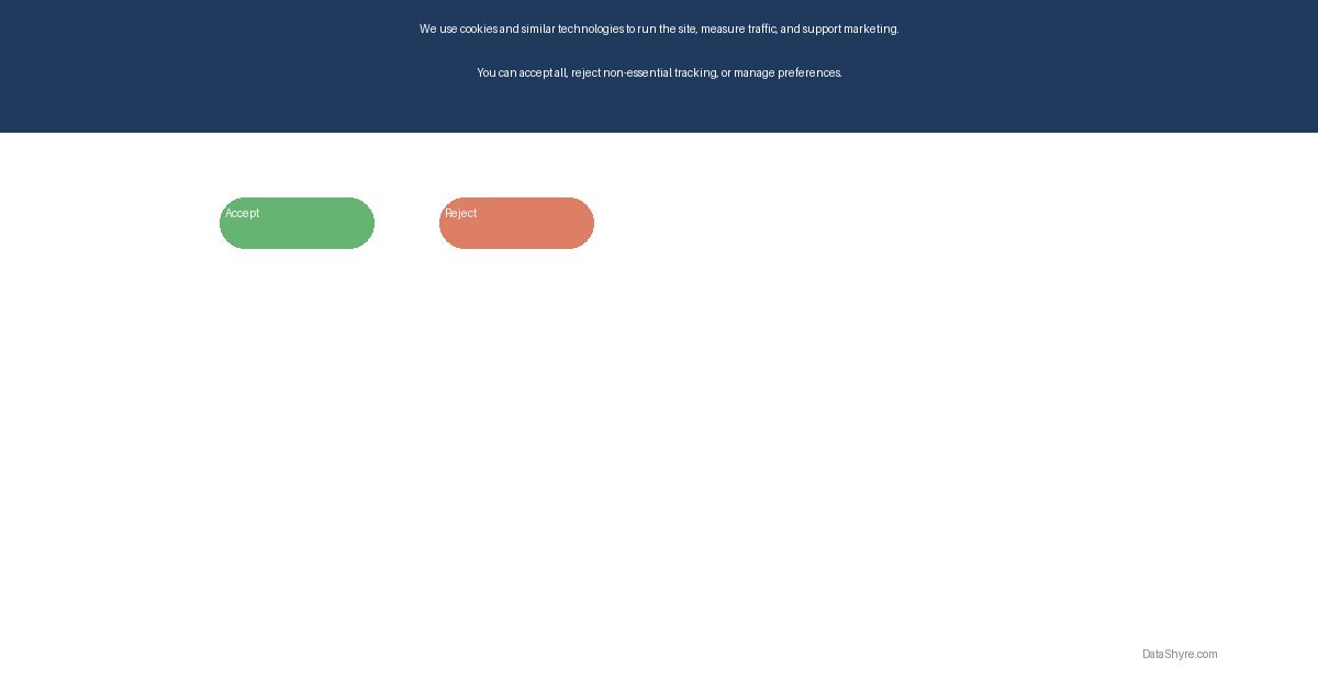
We use analytics and advertising cookies only if you say yes. Choose Accept, Reject, or Settings to control optional cookies.
Why it works: it names the categories, makes the optional nature obvious, and presents a visible no path.
Example 2: Preference-center microcopy
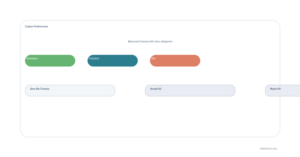
Turn on analytics cookies to help us measure site performance. Keep them off if you do not want visit data used for measurement.
Why it works: it explains the purpose in one sentence and the consequence in the next. No drama. No legal fog.
Example 3: California companion link or notice
Your Privacy Choices
Then support it with a short explainer nearby, such as: use this page to opt out of sale or sharing and manage other California privacy choices.
Why it works: it aligns the copy with the action the user can actually take, instead of pretending every privacy choice is cookie consent.
The wording mistakes regulators keep circling back to
The recurring failures are not subtle.
One is passive-consent language like “by continuing to use this site.” Another is vague benefit language that tells users nothing about analytics, advertising, or third-party tools. A third is asymmetry: the accept option is bright and immediate while rejection is hidden, smaller, or delayed.
That last point matters well beyond Europe. In the CPPA’s 2025 enforcement advisory on dark patterns, Michael Macko put it cleanly: “Dark patterns aren’t about intent, they’re about effect.” If your copy and button labels make refusal slower or more confusing, the banner will be hard to defend.
A five-minute review before you ship
Before the banner goes live, ask five blunt questions:
- Can a normal user tell what optional technologies or purposes are being requested?
- Is the no path as visible and readable as the yes path?
- Does the text avoid passive-consent language and vague promises?
- If the user opens settings, do the labels stay plain and specific?
- If California rights apply, does the site also surface the right privacy-choice link or signal handling?
If you cannot answer yes to those quickly, the text needs another pass.
cookie consent text is not a cosmetic detail. It is the front line of whether a user understands the choice and whether your team can defend the interface later. The best copy in 2026 is short, direct, and boring in the right way.
Sources
- UK Information Commissioner’s Office
- European Data Protection Board
- California Privacy Protection Agency
- CNIL