Cookie Consent Examples in 2026: 7 Patterns That Still Hold Up
DataShyre StaffAug 6, 2026
9 min read
Cookie Consent Examples in 2026: 7 Patterns That Still Hold Up
If you are looking for cookie consent examples on August 6, 2026, the useful question is no longer which banner looks nicest. It is which pattern still works when you test what fires before consent, how easy refusal is, whether preferences can be changed later, and whether the whole setup leaves proof your team can still understand after launch.
That is the right lens because the official baseline is still practical, not cosmetic. On April 29, 2026, the UK ICO finalized its storage-and-access technologies guidance and made clear that the rules reach beyond classic cookies into scripts, tags, pixels, fingerprinting, and similar tools. The European Commission still says valid consent must be freely given, specific, informed, and expressed through a clear affirmative act. France’s CNIL is still warning that rejecting cookies should be as easy as accepting them, and the EDPB’s July 14, 2026 VRT action shows cookie-banner complaints still reach the supervisory level.
If you want the closest companion reads first, start with our guides to cookie consent banner examples, GDPR cookie consent examples, and cookie consent message examples. This article is broader. It focuses on cookie consent examples that still hold up as live operating patterns in 2026.
What makes a cookie consent example worth copying now
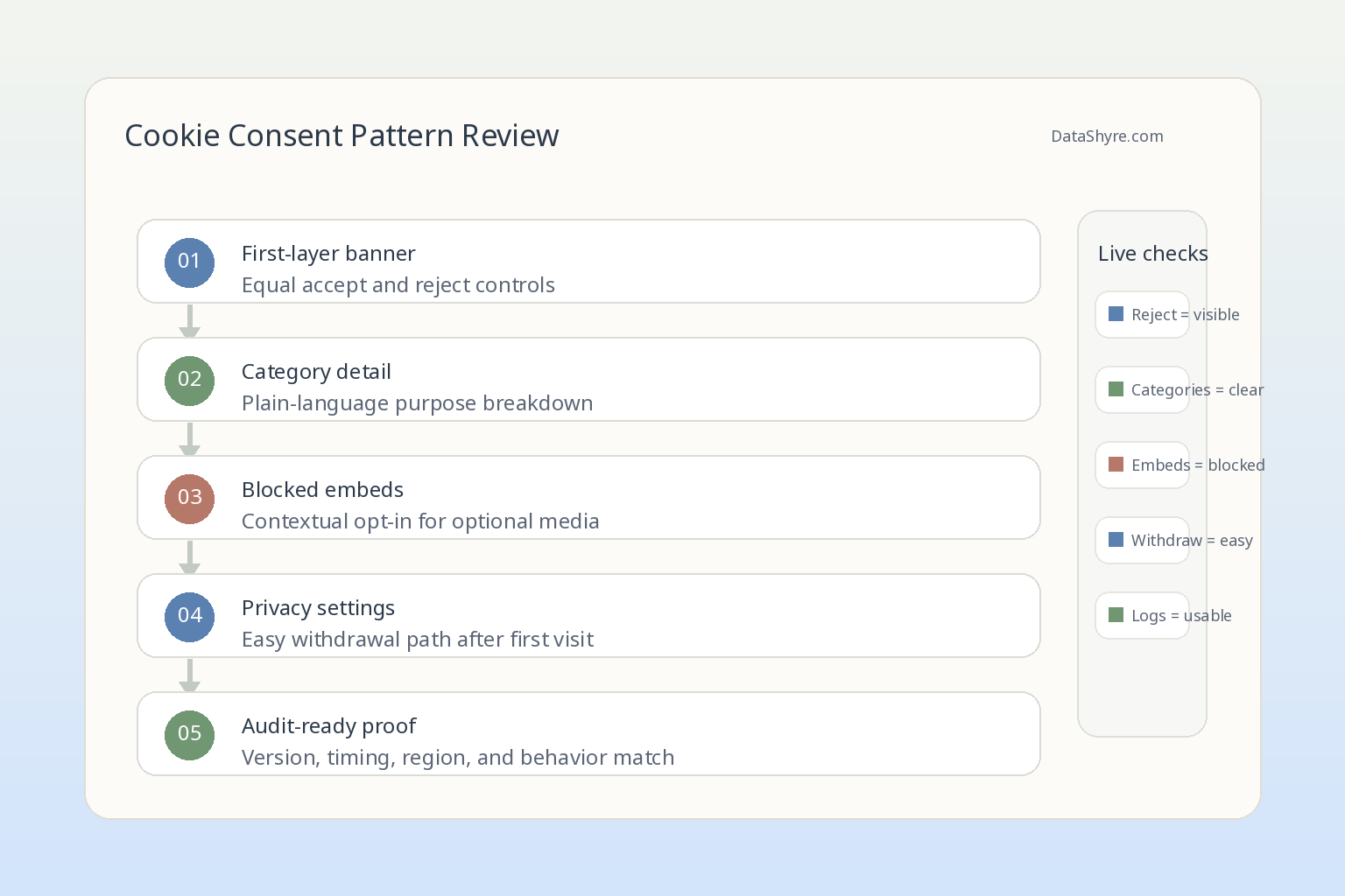
A usable example in 2026 should prove five things:
optional tracking stays off until consent is given where prior consent is required;
refusal is as usable as acceptance;
categories and purposes are understandable;
withdrawal is easy to find and actually changes live behavior; and
records connect the user choice to the version and behavior that followed.
That is why old screenshot galleries are less useful than they used to be. A banner can look clean and still fail the real test underneath.
The ICO’s launch note for the final 2026 guidance captured the bigger goal well when William Malcolm said users need:
“meaningful control over how their data is used.”
>
William Malcolm, ICO
That phrase is a strong filter for any of the cookie consent examples below. If the pattern does not create meaningful control in the live stack, it is not a good example.
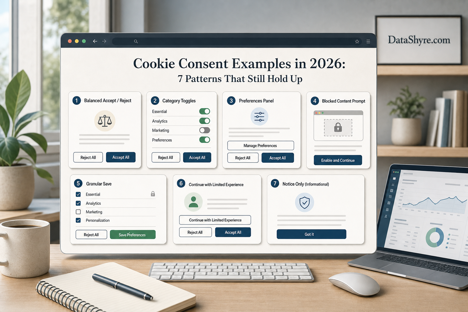
1. The balanced first-layer banner
This is still the most important example because it removes the biggest design failure first.
A solid first layer includes:
a short explanation of why optional cookies or similar technologies are being requested;
an Accept all control;
a Reject all control at the same layer;
a Manage preferences or Customize path; and
no pre-ticked category toggles.
Example copy:
We use optional cookies for analytics, personalization, and advertising. You can accept all, reject all, or choose by category. You can change your choice later in Privacy Settings.
That works because it is short without becoming vague. CNIL’s current notice still states:
“rejecting cookies should be just as easy as accepting them.”
>
CNIL
If your first-layer example hides rejection behind another panel, treats refusal as a text link while acceptance is the only button, or relies on continued browsing, it is not the example to imitate.
2. The category-preview banner
Some sites need a little more detail before the user opens a full preference center. The pattern here is a first layer that previews the categories plainly instead of collapsing everything into a single yes-or-no prompt.
A workable structure is:
Necessary always on and explained;
Analytics off by default where consent is required;
Personalization off by default;
Advertising off by default; and
a one-line description for each category.
This example is useful for larger content, ecommerce, and publisher properties because it makes the request more specific without forcing a full vendor list into the first screen. The European Commission’s current consent guidance still says consent has to be specific and informed. A category-preview pattern helps do that without creating a wall of text.
3. The blocked-content prompt for optional embeds
Some of the best cookie consent examples do not stop at the banner. They also handle the page after refusal.
If a page contains an optional YouTube embed, social widget, or third-party map, a strong pattern is to block the embed by default and show a contextual prompt instead. The prompt should explain what enabling that content will do and let the user opt in to that category from the page where the need actually appears.
Example copy:
This video is blocked because media cookies are optional. You can enable this category for this site in Privacy Settings.
This example works because it keeps the site usable after refusal while still respecting the original decision. It is often better than a cookie wall or a dead space that gives the user no clue what happened.
4. The analytics-only example for simpler sites
Not every site needs a giant preference center.
For a lower-complexity site that only uses essential cookies plus one optional analytics setup, the cleanest example is often a narrow consent request that asks only for analytics consent and leaves everything else out.
That pattern usually works when:
the site truly does not run advertising or personalization trackers;
the analytics tool is optional rather than necessary;
no extra third-party embeds silently expand the scope; and
the team can prove analytics stays off until consent.
This is where many teams overbuild. They copy enterprise CMP layouts full of categories they do not actually use. A tighter example is often better because the user can understand it faster and the implementation is easier to verify.
The catch is honesty. If the site later adds heatmaps, ad pixels, or identity stitching, the narrow example stops being truthful.
5. The region-aware pattern for global sites
One consent example rarely fits every jurisdiction.
For EU and UK traffic, the useful example often centers on prior consent before optional tracking. For California-facing flows, the legal work can shift toward notice, opt-out handling, and honoring browser-level privacy signals when sale or sharing is in scope. Trying to flatten all of that into one generic banner usually creates confusion.
So the stronger example is a region-aware pattern that keeps the interface understandable while letting the underlying logic change by jurisdiction. That might mean:
a consent-first flow for EU and UK visitors;
a different privacy-choice flow for California visitors;
one shared settings entry point with region-specific options underneath; and
a back end that records which logic was shown to which visitor.
If your site operates globally, this is one of the most realistic cookie consent examples to copy because it respects the fact that the same front-end language does not always do the same legal job.
6. The persistent withdrawal path
The best example is not just how consent is given. It is how consent is taken back.
The European Commission’s current guidance says:
“It should be as easy to withdraw as to give consent.”
>
European Commission
That is why a strong example includes a persistent way back in, such as:
a floating privacy icon;
a footer link labeled Privacy Settings;
an account-level consent page where relevant; or
a stable settings item in an app or site menu.
The key is not the exact placement. The key is whether a normal person can find it later and whether changing the choice actually changes the live state of tags, embeds, and downstream tools. If preferences can technically be updated but the user has to search a help center to find the control, the example is weaker than it looks.
7. The audit-ready preference center
The final example matters more to operators than to designers.
An audit-ready preference center is not only a list of toggles. It is a pattern where the recorded choice can later be tied back to:
the categories or purposes presented;
the banner or settings version shown;
the time of the decision;
the jurisdiction logic applied; and
the technical behavior that followed.
This is the example many teams skip because it is less visible than the first banner layer. But it is the one that helps later when a regulator, customer, or internal stakeholder asks what actually happened on a specific day.
The EDPB’s current cookie-banner enforcement activity is a reminder that complaints do not stop at user interface screenshots. They can reach the merits. So if you are borrowing cookie consent examples, borrow the proof model too.
What the weak examples still get wrong
The patterns that age badly tend to fail in familiar ways:
they use one-button acceptance with a buried reject path;
they group unrelated purposes into one broad consent request;
they rely on pre-consent tracking that the banner wording never mentions;
they make withdrawal hard to find; or
they save a preference without changing runtime behavior.
Those flaws matter because the current regulator direction is consistent. The ICO’s 2026 guidance adds more practical detail about objection and multiple purposes. CNIL is still active on dark patterns and tracking enforcement. The EDPB is still treating cookie-banner disputes as real supervision work, not as a solved website-design problem.
A short review sequence before you copy any example
If you are evaluating cookie consent examples for your own site this week, use this order:
Test what fires before any user interaction.
Check whether Reject all is available as easily as Accept all.
Review whether each optional category is actually explained in plain language.
Reject optional categories and verify that the related tags or embeds stay off.
Reopen settings later and confirm withdrawal works cleanly.
Check whether the recorded consent data would make sense to legal, support, and engineering.
That sequence reveals quickly whether the example is operationally strong or only visually polished.
Bottom line
The strongest cookie consent examples in 2026 are not the flashiest banners. They are the patterns that give users a fair choice, keep optional tracking off until the right moment, support easy withdrawal, and leave behind records your team can actually use.
If you need a simple rule for choosing between examples, use this one: copy the pattern that still makes sense in DevTools, in your preference logs, and in a complaint review, not just in a design mockup.