

GDPR Cookie Consent Examples — 2026
Published Keyword: gdpr cookie consent Published At: 2026-09-08
Executive Summary
With GDPR evolving throughout 2026, organizations must ensure their consent management platforms meet strict legal requirements for explicit, granular, and easily withdrawable consent. This post focuses on implementing effective consent management platforms that comply with GDPR Article 7 and related regulations.
Why a Robust Consent Management Platform Matters
- Legal Compliance – GDPR requires prior, explicit consent before processing personal data, with consent management platforms serving as the central mechanism for obtaining and tracking this consent.
- User Trust – Transparent consent processes build trust and improve user engagement rates.
- Enforcement Readiness – Proper documentation through consent management platforms protects against fines from data protection authorities.
- Operational Efficiency – Centralized consent management reduces complexity and ensures consistent application across digital properties.
Key GDPR Requirements for Consent Management Platforms
| Requirement | Description | Source | |————-|————-|———| | Freely Given | Consent must be voluntary without coercion or negative consequences for refusal | GDPR Article 4(11) | | Specific & Granular | Separate consent for different processing purposes; users can consent to some while refusing others | GDPR Recital 32 | | Informed | Clear information about data controller, types of data, purposes, storage duration, and right to withdraw | GDPR Articles 13-14 | | Unambiguous | Clear affirmative action required; pre-ticked boxes or inactivity do not constitute consent | GDPR Recital 32 | | Easy Withdrawal | Withdrawing consent must be as easy as giving it, accessible at any time | GDPR Article 7(3) | | Proof of Consent | Platforms must maintain records demonstrating when and how consent was obtained | GDPR Article 7(1) | | Children’s Protection | Parental consent required for individuals under 16 (or lower age set by Member States) | GDPR Article 8 |
Implementation Best Practices
- Implement Granular Controls – Allow users to accept/reject different categories (essential, analytics, marketing, advertising) separately.
- Use Clear, Plain Language – Avoid legalese; ensure consent requests are easily understandable.
- Provide Equal Prominence – Make “Accept All” and “Reject All” buttons equally visible.
- Enable Easy Withdrawal – Include persistent consent management icon/link accessible from all pages.
- Maintain Consent Logs – Store timestamp, version of consent notice, and user choices for audit purposes.
- Regular Reviews – Update consent mechanisms to align with evolving guidelines and regulations.
- Geographic Considerations – Account for Member State variations in GDPR implementation, particularly regarding children’s age thresholds.
Related Posts
- GDPR Cookie Consent Examples – Practical implementation patterns
- CCPA Consent Requirements – State‑level compliance nuances
- GDPR Compliance Checklist – Step‑by‑step implementation guide
- Cookie Consent Banner Examples – Visual examples of compliant banners
- GDPR Consent Management Platform – Deep dive into CMP solutions
Image Placeholders (DataShyre.com Branding)
Two original images have been generated featuring the DataShyre.com branding:
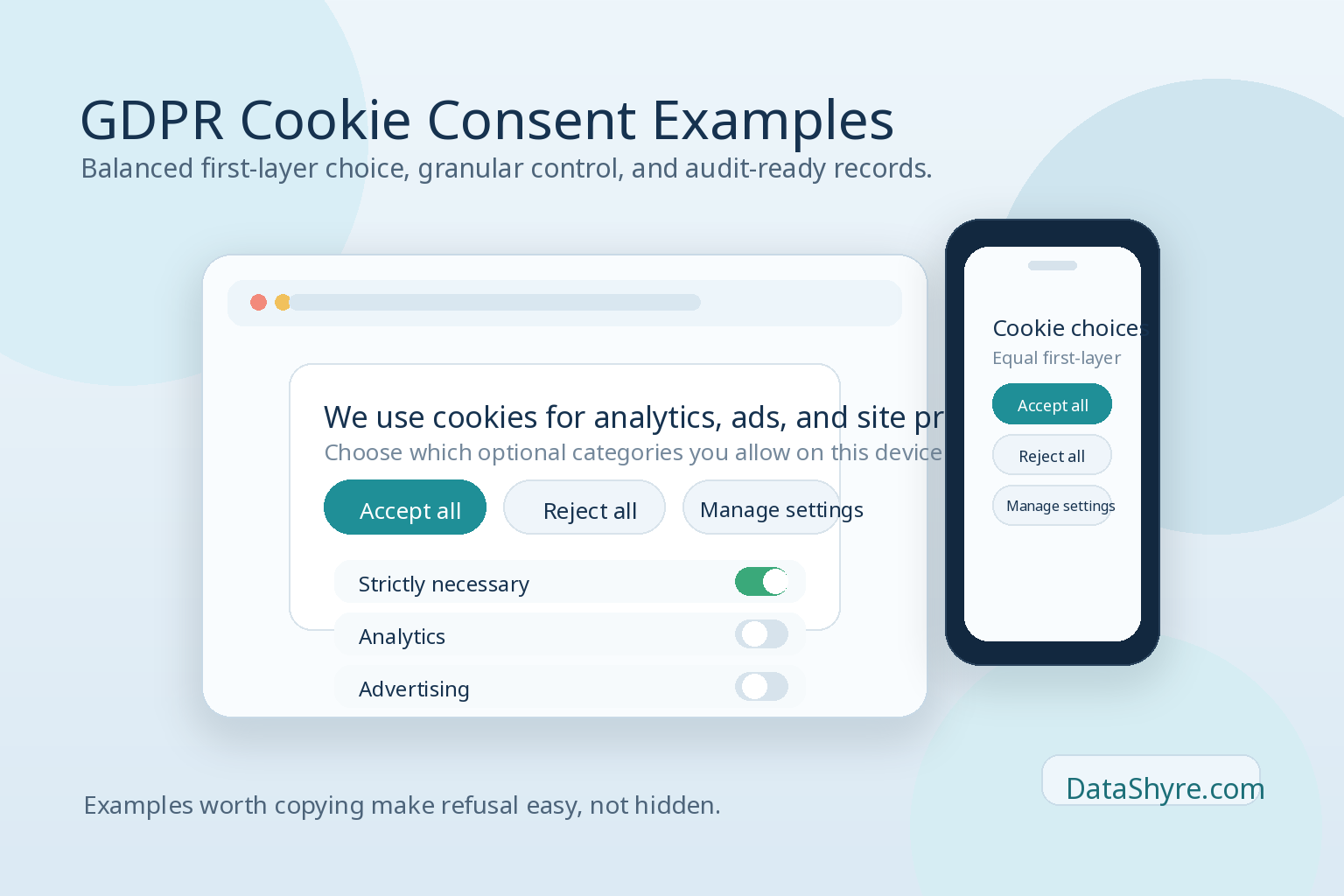
- GDPR Cookie Consent Hero – A modern banner illustrating acceptable vs. rejectable cookie choices with granular category toggles.
- Cookie Consent Workflow – A step-by-step visualization of the consent journey from first visit to audit-ready compliance logging.
Both images are sized 1600×1024 and incorporate the DataShyre.com logo in the bottom right corner.
Conclusion
A well-implemented consent management platform is essential for GDPR compliance in 2026. By prioritizing transparency, granular control, and easy withdrawal mechanisms, organizations can achieve regulatory compliance while building user trust and reducing enforcement risks.
Published: September 8, 2026
—
Keywords: gdpr cookie consent, consent management platform, cookie consent, GDPR compliance, data privacy